Sunday, May 1, 2011

26.purple

I used this purple vase for the word purple. I rotated it, and i also increased the brightness. I used picnik to edit this photo.

23.Red

I used a set of red flowers for the word red. I used the HDR effect which made it more clear and more sharp to really make it stand out.

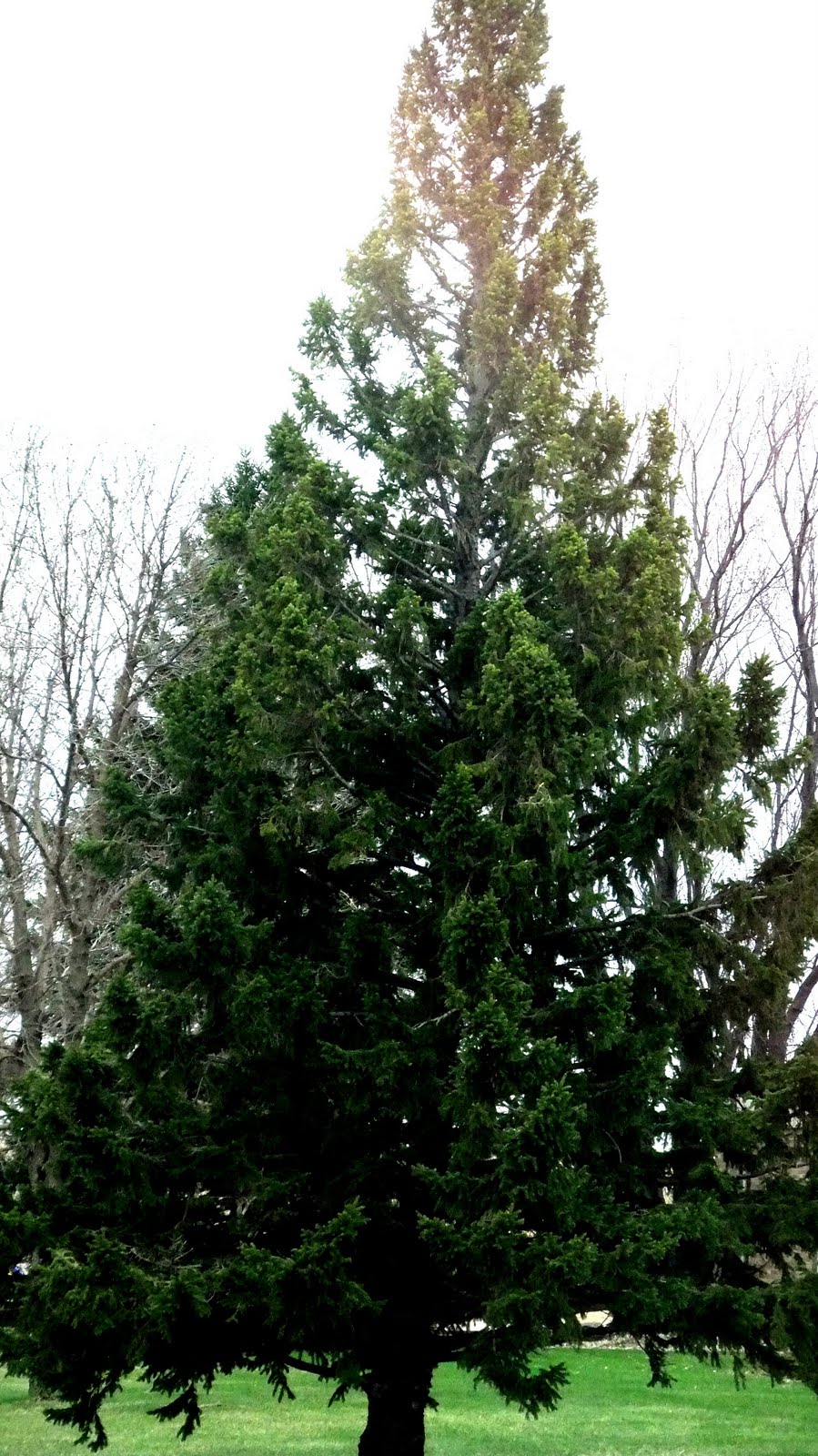
37.Tree

I took this picture of a tree right in front of our school, for the word tree. I made it lighter and changed the contrast of the picture but kept the exposure the same i also cropped the background out. I used picnik to edit this photo.

38.water

I rotated this picture and lowered the saturation and temp. increasing the contrast also. giving it a blue look! I used picnik to edit this photo.

8.Retro

I used this photo for retro, it was part of another kids artwork that i thought would fit perfectly. I increased the temp and also increased the contrast. i tried to make it pop so you could tell it was glittler. I used picnik to edit this photo.

11.yellow

I used a mop bucket for the word yellow. I increased the contrast and used the cinema scope effect to brighten this photo. used picnik to edit this.

27.Green

On this picture i enhanced the colors and made them warmer to pop out the green more! I used picnik to edit this photo.